

If you are an aspiring food blogger, you’ll find answers here to photography basics you need to get started: the different types of food photography, color management, proportions, i.e. Rule of Thirds and depth of field, and much more.
About proportions: The Golden Cut
Or where does the Rule of Thirds come from?
Proportions are a key element in photography and the arts, like painting and sculpture, and in architecture. They create relationships between pictured objects and display them to greatest advantage. Best of all is when the proportions create tension between objects, with the edge or the background.
But how to achieve this tension? This is where a particular kind of ratio enters the picture.
In the design context, a ratio is the relationship between two values, e.g., 1:2 (mind you, 1 part and 2 parts add to 3, see the Rule of Thirds coming?).
There is a ratio in nature that occurs particularly often: 1:1.618033. It seems to be an odd and accidental value. But if we analyze different natural forms mathematically, we very quickly come up with the number series 1 – 1 – 2 – 3 – 5 – 8 – 13 and so on. This is called the Fibonacci series, after the mathematician of the same name. You arrive at it by adding two numbers in the series to get the next value.
What proportion hides in this number series?

The higher the values, for example, 3:5 or 5:8, the closer the ratio approaches 1.618033 better known as the Golden Cut, Divine Proportion, or Golden Ratio!
We recognize this value as “naturally beautiful” because it is omnipresent in nature and our eye is used to seeing it.


Glad to be of service, guys! You can thank me later.
Symmetry is also beautiful, as reflected in a 1:1 relationship, for example, but which is not particularly exciting. Ratios of 2:3 or 3:5 create more powerful tension between objects, a visual relationship that appeals to the eye. Or to keep things simple, comply to the Rule of Thirds by respecting a 1:2 relationship. That’s a pretty good proxy already for attractive proportions.
And just what does that have to do with my photo shoots?
First, it means that only rarely should you put people or objects in the center of a photo. It will probably result in a boring image. Better to position the subject to the right or left of the center, keeping the foreground or background in mind, and this way you will create that famous tension between the spaces to the left and right of the subject.
You can see how the same principle would apply in food photography: keep the subject out of the middle, but preferably to one side in a ratio of 1:2. This is why many smartphone photo apps have two vertical and horizontal lines in the viewfinder: they put them there to help the user arrange objects precisely in a ratio of 1:2. This actually applies to both width and height.
Food photo camera angles
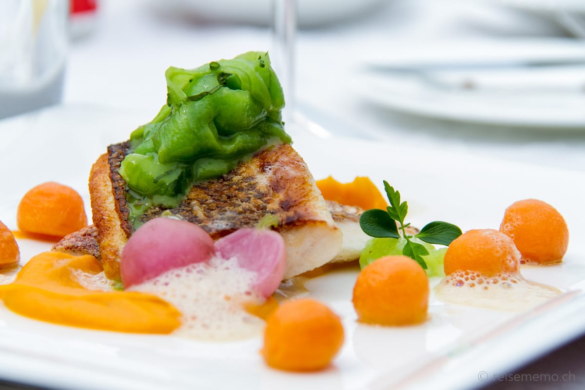
In food photography, there are two main angles to shoot from: “flat lay” or overhead shot and “spatial perspective” at roughly 30 to 45 degrees. The former means you photograph plates and dishes from directly above, the latter, from the side.
So far as I can tell, which of them you choose is a matter of individual preference. It is simply a matter of taste. In any case, with a flat lay just make sure not to frame the dish right in the middle — unless how the food is arranged on the plate creates the requisite tension for an attractive shot. And when it comes to perspective, there is still a whole lot more to watch out for…
And here they are: 14 tips and related design principles for food bloggers
1. Use flat lay with clipped plates to help distinguish proportions
The proportions of round picture elements will be more obvious to the eye when you clip them so part of them is out of the picture frame. Creating tension between round objects is difficult because the irregular shapes between them are not easy for the eye to grasp. Basic geometric shapes are easier to recognize.
This composition by Charlotte Meyer plays expertly with soft sidelight and the tension between the main motif and the out-of-focus “eye catchers” on the edge. The eyes tensely jump from one to the other and back again.


2. Use flat lay with soft sidelight
The soft sidelight in this photo produces various shadow nuances. For publication in the business magazine Bilanz, the picture was suitably cropped, similar to Charlotte’s shot above.


3. Make creative use of reflection
Reflections from lights or candles can enhance a composition. In “beautiful” restaurant lighting, you next need to pay attention to the photo’s color temperature: a yellow cast is almost foreordained. It is easily corrected with photo editing software like Adobe Lightroom.

In Lightroom the image can also be rotated slightly if the orientation is off – as for tilted glasses. You can also dim “highlights” like candles or spotlights so that they don’t jump out of the picture.

Do this by moving the slider for white a bit higher; the plates will look whiter and the food will stand out more. Here, the overall yellow cast is easy to see in the unretouched photo in the gallery.
4. Use lower aperture setting for better depth of field
Depth of field is controlled with aperture: a deep aperture number like 3.5 equals a big aperture, i.e. a large lens opening. This will reduce the depth of field. Small apertures like 16 or 18 will increase the depth of field. As the next photo shows, setting too large an aperture will reduce what will be recognizable in the photo.
The newest generation smartphones simulate this effect with software. In the viewfinder, you let the phone mark the spot you want in sharp focus; the rest of the image will stay slightly out of focus.


5. Capture motion at the plate (video allowed!)
Have your camera at the ready to capture “action” on the plate… (if need be also with video).


6. Shoot two plates if you got ’em
When eating in good company, the second plate can figure as another element in the composition. Make sure that the other people don’t distract from the picture.


7. Use diagonals for dynamic picture compositions
Photos that contain diagonal elements often look more lively.

Commercial kitchens like Christian Geisler’s in the Kunsthof in Uznach, Switzerland generally are relatively well-lit, yet photography with external flash apparatus is always recommended. The chefs are almost constantly moving about while at work – unlike their food, which should be photographed always without direct flash (or it seldom will turn out well.)
8. Pay attention to obvious proportions and tension
Although the following photo tries to make use of diagonal elements for dynamic effect, it places the main subject too much in the middle. The proportions go out the window as a result and hence the image’s power. Not to mention the yellow cast ;-)

9. Develop your own visual style
Over time, the devoted and demanding photographer will want to develop her or his own visual style. I’ve lately tried it with “eye catchers,” i.e., objects that actually distract but in so doing lead the eye to the object you want to call to the beholder’s attention.

10. Show up early in the restaurant
As a food blogger, it pays for you to show up early in restaurants. It lets you do location shots before running the risk of copyright or privacy infringement with other guests present in the establishment. I recommend without qualification: never photograph other guests. It could also get the restaurant into copyright hot water…


11. Focus attention with a vignette
Depending on the subject, a vignette can be a suitable styling tool for putting focus on the center of a picture. It consists of reducing an image’s brightness or saturation around its edges compared to its middle to create a continuous, slightly dark border.


12.Use a color palette that suits the subject
The photo’s color scheme can enhance the pictured food, brown coffee in this example.

13. Tell stories
A photo can also reinforce the story you want to tell: in the following example, an article is titled “Not Tex-Mex.” And that’s exactly what the photo is about, says the kind reader and, curiosity piqued, goes on reading.


My advice is, in principle, be generous with storytelling: a terse description of a restaurant and food on offer can make for boring reading. Story telling methods allow building an arc of suspense that enlivens the story just as it does photos. Here is an example of how storytelling consultant Joel Blom pepped up the About Us page of our own travel blog.
To summarize, the food blogger intent on good photos pays attention to:
- Proportions in the Golden Cut or Rule of Thirds
- Coloration
- Light direction
- Fore- and background
- Supporting objects
- Full or partial illustration
- Spatial perspective vs. flat lay
- White balance
- Depth of field
And good food, it goes without saying ;-)
But 13 tips still aren’t 14. Hence, here is one more little trick:
14. Bonus tip for better pictures and SEO: food bloggers, shoot the menu!
Relevant keywords will boost search engine optimization (SEO). But photos can also be given names that describe their content. That makes it easier for search engines to display the relevant photos if someone is searching on pictures in Google or Bing. So that you will remember what it was you supped on later when editing your images, it pays to photograph the menu!


Thanks to food bloggers and/or photographers Charlotte, Fabian, Nicolas and Anita, and Harry for making their photos available!
Bon appétit, mes amis!


